

Gallery 23 block design & features
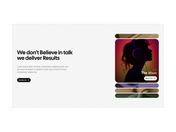
The section places a text column on the left and an accordion-style image stack on the right, all inside a muted-background panel bordered by dashed SVG lines that extend beyond the container edges. The left column holds a large heading, a paragraph, and a round shadcn/ui Button with an arrow icon. On the right, five images are stacked vertically; the active one animates from a collapsed 2.5rem strip to a full 24rem-tall rounded card, while the others shrink back down.
When an image expands, a gradient overlay fades in from the bottom and a detail panel slides up showing a product code, a split-styled title with an italic second word, and a secondary round button with a cart icon. The dashed SVG borders on all four sides of the outer panel create a blueprint-like framing effect that adds graphic structure to the layout.
The feel is editorial and product-oriented, mixing large photography with interaction-driven reveals. The dashed-border treatment and muted background give it a structured, almost wireframe quality that contrasts with the rich imagery inside the accordion.
On smaller screens the two columns stack vertically, with the text panel appearing above the image accordion.