
Gallery 17 block design & features
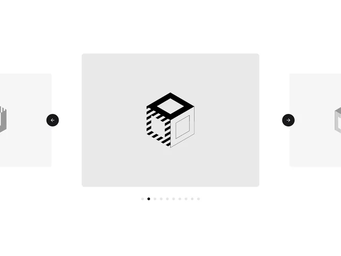
Gallery17 is a centered image carousel built with shadcn/ui. A small eyebrow and heading sit above a full-width row of landscape photographs, with the active slide in the middle and its neighbors peeking in from both sides. Under the row, the active title and location sit above a pair of round outline arrow buttons with dot pagination between them.
Scale and opacity are tied directly to scroll position rather than switched on selection, so slides grow and brighten smoothly as they are dragged toward the center and shrink and fade as they move away. The active dot stretches into a short pill with a soft ease, and the loop wraps in both directions.
It is polished and calm, a refined take on a common carousel pattern that suits portfolios, property listings, and travel. It needs a set of landscape images with a title and location for each.
On mobile the slides take up most of the width while still hinting at their neighbors.