Gallery 16 block design & features
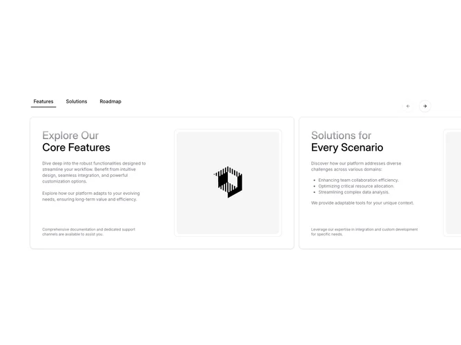
The Gallery16 component is a sophisticated shadcn block designed to present content in an engaging and interactive format. It utilizes a combination of tab and carousel elements to enable users to seamlessly navigate through different content categories. This component is particularly beneficial for showcasing various informational segments, such as features, solutions, and roadmaps, within a unified interface, enhancing the user experience by allowing easy comparison and discovery of details across multiple areas.
Delving deeper into the component's structure, Gallery16 employs a series of tabbed headers above a carousel to provide a quick selection mechanism for different content categories. As the user interacts with the tabs, the displayed content updates to reflect the selected category, with smooth transitions enhancing the interaction. The visual presentation is further enriched with customizable text and image elements, alongside notes and descriptions that offer additional context. The use of a gradient text design for category titles adds a modern and visually appealing touch. This shadcn ui component's design facilitates an intuitive user flow and high engagement with its structured content layout.