

Gallery 5 block design & features
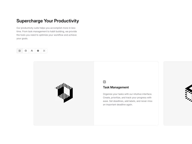
The block starts with a heading and paragraph on the left, followed on desktop by a Shadcn UI ToggleGroup row of outline-variant icon buttons. Selecting a toggle scrolls the carousel to the matching slide, and swiping or arrowing through the carousel updates the toggle selection in return, keeping both controls in sync via the carousel API.
Each slide is a bordered card split into two columns on medium screens and above. The left column holds a 4:3 image, and the right column stacks a Lucide icon, a title, and a multi-line description. The carousel container applies a CSS mask gradient on both edges that feathers slides into transparency, preventing hard clip boundaries. On mobile, arrow buttons replace the toggle group and the carousel switches to drag-free mode.
The dual-control pattern gives the section a product-demo feel, letting users jump directly to a feature via the icon bar or browse sequentially. The bordered cards and side-by-side image-text layout keep the presentation structured and information-rich without heavy decoration.