
Gallery 10 block design & features
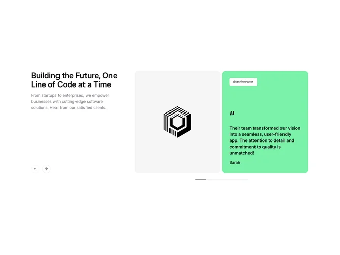
The block uses a two-column layout with a fixed text panel on the left and a Shadcn UI Carousel on the right. The left column holds a heading, a paragraph of supporting copy, and two round icon Button components for previous and next navigation. The right column scrolls through testimonial slides, each composed of a square image beside a colored quote card carrying a Badge with the username, a large quotation mark, the quote text, and the author name.
Each quote card uses a distinct background color from the data set, such as green, orange, or purple. The large rotated quotation mark, semibold text, and generous padding give the cards a bold, magazine-style treatment. A thin horizontal progress bar beneath the carousel tracks the current slide position.
The component leans into a modern editorial feel with its oversized type, bright accent panels, and clean separation between static copy and scrollable content. The drag-free carousel option keeps the interaction lightweight.
On mobile the left column and carousel stack vertically, and the navigation arrows are hidden to rely on swipe gestures.