
Pricing 22 block design & features
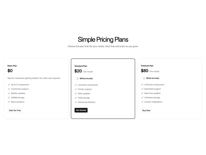
Built with Shadcn UI, this pattern uses a centered title and optional subtitle, then three equal-height cards. Each card shows the plan name, price with period, and on paid tiers a switch labeled for annual billing that stays in sync across cards so every price updates together. Free tiers skip the switch row and show descriptive copy instead. Feature lines use simple checks and muted text. The recommended plan carries a thicker primary-colored border on the card shell.
Surfaces stay close to default card chrome with little shadow, so the border on the highlighted column does most of the work. Buttons are width to content rather than full bleed, which keeps rows feeling light.
The layout is a standard SaaS tier row with the unusual twist of placing the billing switch inside each paid card. Complexity is still limited to one boolean for annual versus monthly pricing.
Narrow viewports stack the cards full width while the highlighted border remains visible.