Shadcn Pricing Cards (3 Plans) Blocks

Browse and download 18+ Shadcn UI Pricing Cards (3 Plans) blocks. Built with React, Tailwind and shadcn/ui. These shadcn components are ready to download, copy and paste or install with the shadcn registry.

Shadcn Pricing 34 - Three-plan pricing with billing toggle and mobile carousel

Three-plan pricing with billing toggle and mobile carousel

Shadcn Pricing 47 - Container-wide three-plan pricing with toggle and carousel

Container-wide three-plan pricing with toggle and carousel

Shadcn Pricing 41 - Narrow three-plan pricing cards with per-column switch

Narrow three-plan pricing cards with per-column switch

Shadcn Pricing 22 - Three-plan pricing cards with per-column billing switch

Three-plan pricing cards with per-column billing switch

Shadcn Pricing 44 - Narrow stacked three-plan pricing with switch and mobile carousel

Narrow stacked three-plan pricing with switch and mobile carousel

Shadcn Pricing 48 - Full-container three-plan pricing with switch and carousel

Full-container three-plan pricing with switch and carousel

Shadcn Pricing 3 - Three-plan pricing with billing switch and dashed feature rows

Three-plan pricing with billing switch and dashed feature rows

Shadcn Pricing 49 - Three-plan pricing in one horizontal band

Three-plan pricing in one horizontal band

Shadcn Pricing 50 - Three-plan pricing with centered spotlight column

Three-plan pricing with centered spotlight column

Shadcn Pricing 20 - Bordered three-plan pricing grid with plan icons and dividers

Bordered three-plan pricing grid with plan icons and dividers

Shadcn Pricing 31 - Three-plan pricing with icon feature rows and top pill

Three-plan pricing with icon feature rows and top pill

Shadcn Pricing 24 - Three-plan pricing with switch and muted highlight cards

Three-plan pricing with switch and muted highlight cards

Shadcn Pricing 16 - Three-plan pricing with billing tabs and checkmark features

Three-plan pricing with billing tabs and checkmark features

Shadcn Pricing 4 - Three-plan pricing with tabs and one highlighted column

Three-plan pricing with tabs and one highlighted column

Shadcn Pricing 52 - Three-plan pricing carousel at all breakpoints

Three-plan pricing carousel at all breakpoints

Shadcn Pricing 57 - Developer-style three-plan pricing

Developer-style three-plan pricing

Shadcn Pricing 91 - Three plan columns with tier logos and billing toggle

Three plan columns with tier logos and billing toggle

Shadcn Pricing 90 - Three tall pricing cards with billing toggle

Three tall pricing cards with billing toggle

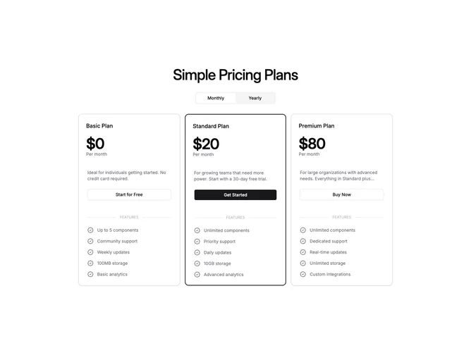
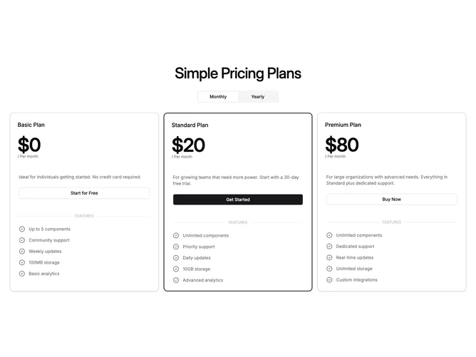
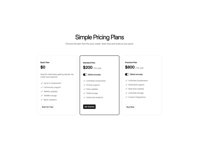
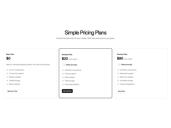
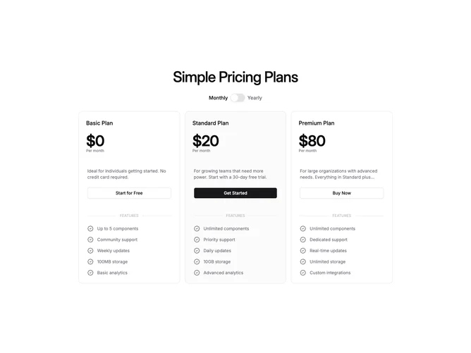
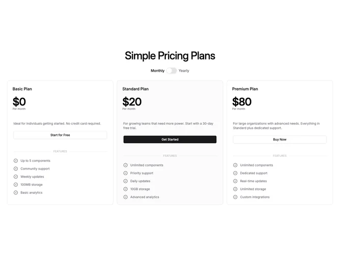
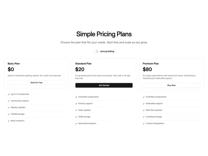
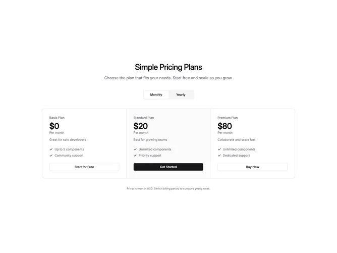
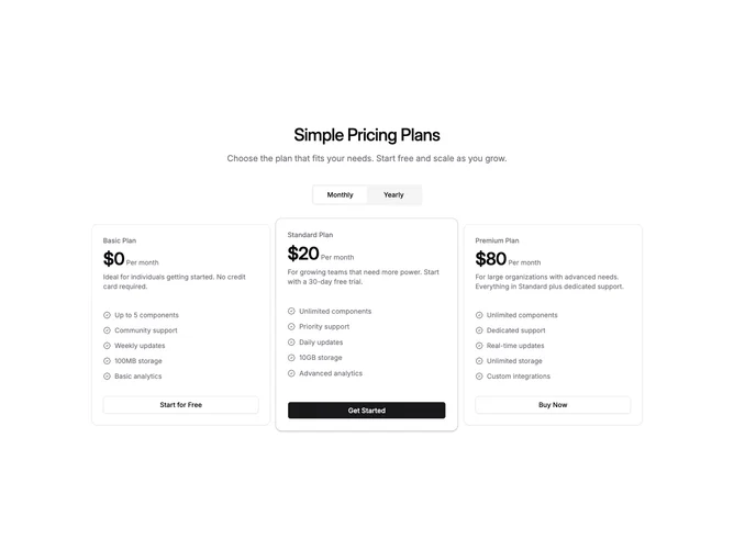
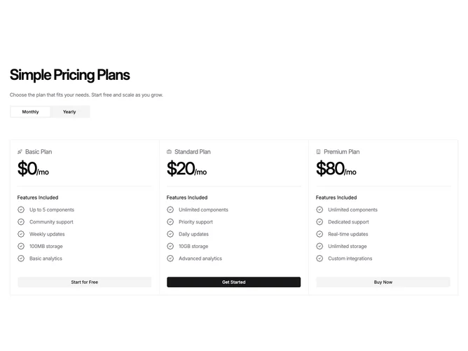
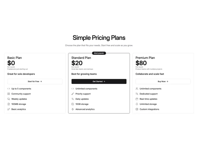
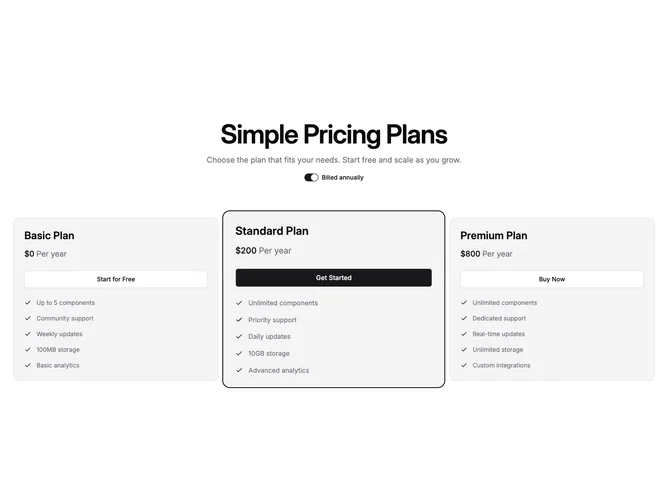
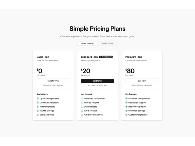
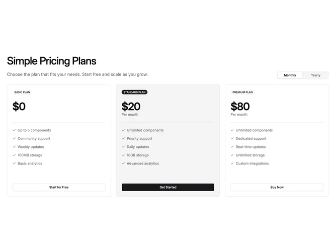
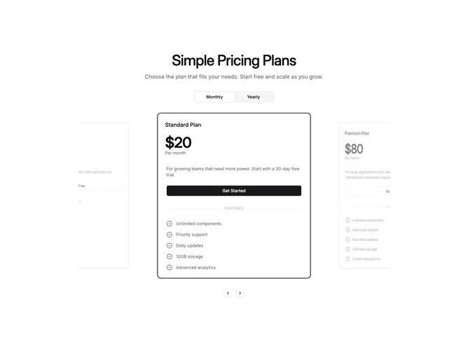
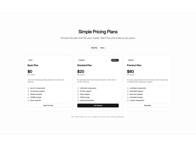
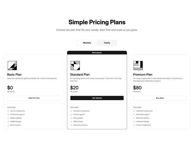
Shadcn Pricing Cards (3 Plans) Blocks, Sections & Components

A shadcn pricing cards (3 plans) block displays pricing content structured around 3 plans. This layout provides clear comparison between options while maintaining a balanced visual hierarchy.

Each block is a self-contained React component which you can copy/paste the code or install via the shadcn CLI. You own the code — customize the layout, content, and styling using Tailwind utility classes.