Pricing 31 block design & features
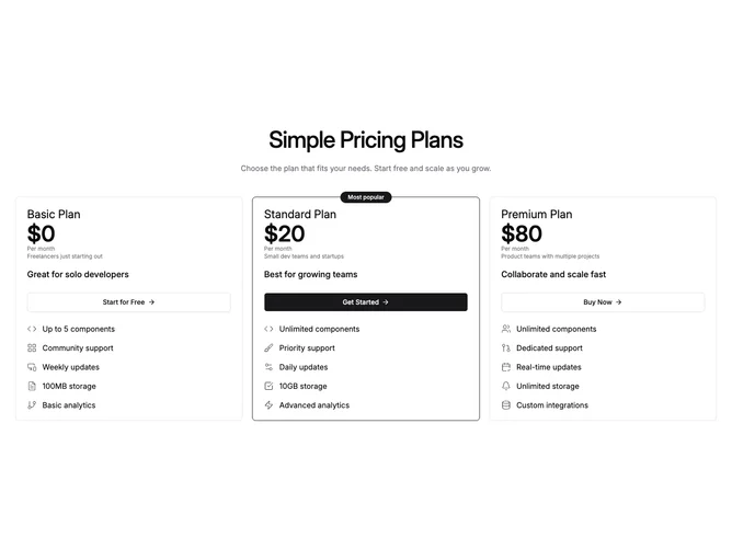
This block uses Shadcn UI for a simple centered title and optional supporting line, then three plain bordered panels in a row. There is no billing toggle in the section: each card shows a monthly-style price line, secondary lines for period and audience hints where provided, a full width button with arrow affordance, and a vertical list where each feature pairs an icon with text so scanning feels like reading labeled bullets. The popular tier can show a small pill anchored to the top edge plus a stronger primary border.
Typography uses large numerals and medium weight headings without serif styling. Spacing between icon rows is even and readable on desktop.
Compared with blocks that reuse one check icon for every row, this version adds more visual variety through icon choice and reads slightly richer while staying column-based rather than tabular.
Moderate content needs: distinct short feature lines and coherent icon choices per row.