
Pricing 20 block design & features
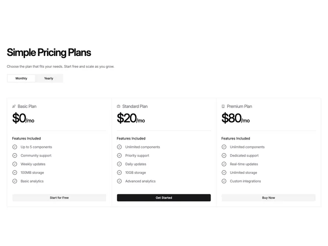
This section is built with shadcn/ui around a large heading, supporting paragraph, and a compact billing toggle aligned to the left. Below, three vertical columns sit inside one bordered frame with visible dividers between them, so the layout reads like a structured table without row-based comparison. Each column places a small icon beside the tier name, an oversized price with period suffix, a short features list with badge-shaped check icons, then a button. The highlighted tier uses the filled button style while others stay on secondary.
The look is editorial and print-influenced: hairline borders, strong horizontal rhythm, and tight negative letter-spacing on prices. There are no floating rounded cards or drop shadows, which makes the block feel architectural.
Overall it reads serious and information-dense, more like a newspaper finance layout than soft marketing cards. Complexity is moderate through divider lines and typography alone rather than illustration.
On small screens the three bands stack with horizontal dividers between them instead of side-by-side columns.