Pricing 90 block design & features
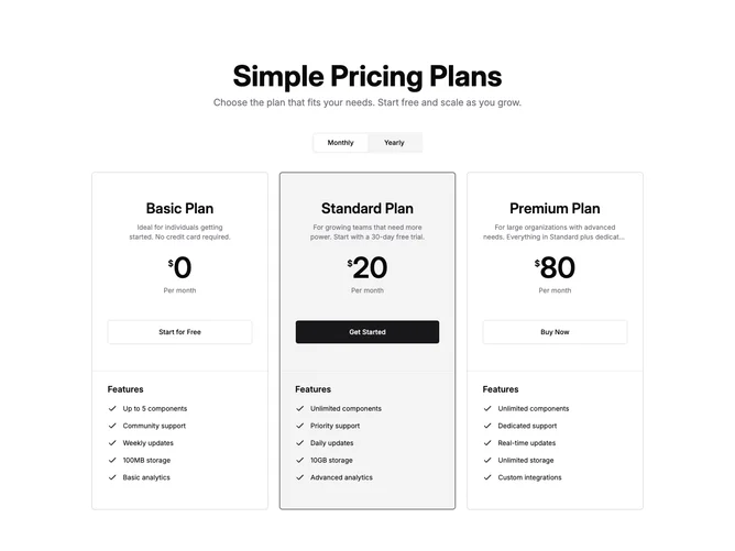
Built with shadcn/ui Card, Button, and ToggleGroup, this section keeps the centered large title treatment and the tall upper panel of the classic four-tier columnar strip, but limits the grid to three independent cards so each tier owns its own border and stack. A shared control swaps every price and description between monthly and yearly billing without leaving the page.
The recommended plan picks up a primary border and muted wash so it mirrors the old highlighted column, while the other two stay on the default card shell. Prices render with a modest currency mark and oversized numerals; feature blocks sit below a top rule with primary check icons and a short Features heading, matching the checklist rhythm of that columnar pattern.
Overall it reads like a spacious marketing comparison with more vertical room than tight card rows, closer to editorial pricing than a dense table. The layout is moderate in complexity: boolean billing state, three repeating cards, and static typography with no motion.
On medium widths the grid goes two columns before locking to three across on large screens, so the third card wraps cleanly instead of squeezing unreadably narrow.