

Pricing 34 block design & features
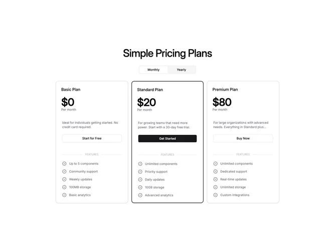
Built with shadcn/ui, the section centers a title, then a pill-style control that flips between monthly and yearly billing. On wide layouts three cards appear in a restrained-width column within the page. Each card shows the tier name, large price, period label, short description with line clamp, primary or outline button, a labeled horizontal band that reads as a feature section header, and a checklist where every row uses the same badge check icon for consistency. The recommended tier picks up a stronger colored border rather than a tinted fill.
Card shells are rounded with single-weight borders and no drop shadow. The billing control sits on a soft muted track.
When horizontal space is tight, the same cards move into a carousel with masked side edges and arrow controls, usually opening on the recommended tier first.
The block is moderate in complexity because billing choice and carousel state both need to stay aligned with the highlighted tier.