Pricing 50 block design & features
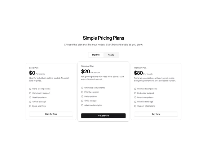
This block uses shadcn/ui for a centered title, optional description, and a monthly or yearly billing control. Three cards sit in a wide grid where the tier marked as recommended scales slightly forward and gains a subtle ring border so the middle or flagged column reads as the spotlight. Each card lists a capped number of features with badge-shaped checks, price and period text tied to the toggle, and a bottom button that switches between primary and outline roles.
Spacing stays airy with consistent padding inside every card even when the center column lifts visually.
The look is assertive product marketing without devolving into neon gradients. Complexity is moderate because layout emphasis is handled through scale and ring rather than extra illustration.