Pricing 41 block design & features
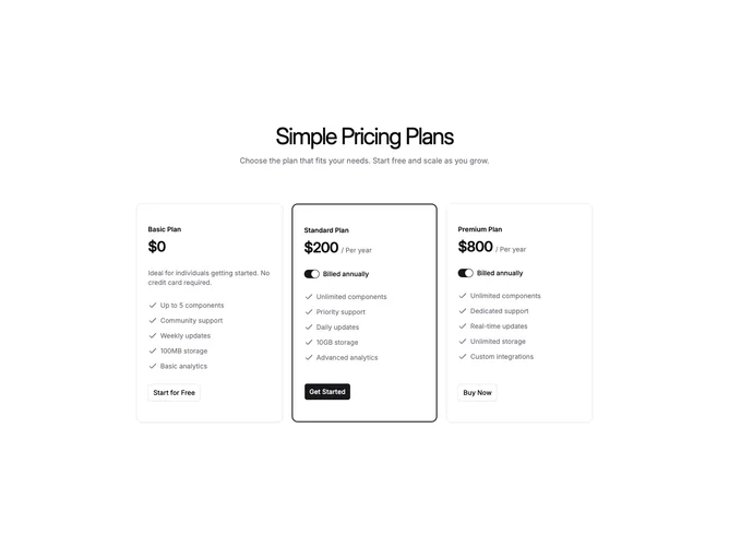
This section uses Shadcn UI with a centered heading and optional description constrained to a medium page width. Three cards follow the same rules as the wider per-switch variant: paid tiers expose a yearly billing switch row with shared state, free tiers omit that row, features use small checks with muted captions, and width-limited buttons anchor the bottom. The middle or marked tier carries a thick primary border for emphasis.
Padding and typography stay compact so the grid breathes inside the narrow wrapper rather than spanning the full content width.
Visually it is understated and utilitarian, with the border on the recommended card as the single strong accent. Behavior stays simple with one annual flag controlling every price.
On phones the cards simply stack without carousel chrome.