Pricing 24 block design & features
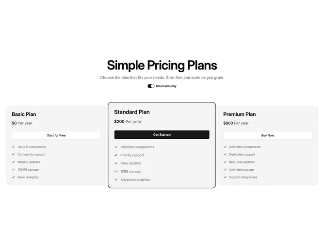
Built with Shadcn UI, this layout centers a title and optional description, then a single labeled switch for annual billing that updates every card together. Three cards sit on the semantic muted surface color so light and dark themes both stay on palette. Each card shows the plan title, combined price and period line, a large button, then a vertical list of features with small checks tinted to the theme primary color. The recommended tier sits in a slightly enlarged frame and gains a primary-colored ring with ring offset against the page background so it reads as the focus column.
Visual weight comes from muted panels and typography rather than ad hoc gray scales. Spacing between cards is generous and the grid moves from two columns to three as the viewport grows.
The pattern feels bold and product-led compared with flat white cards, mainly because of the scale and ring emphasis. Overall complexity is moderate with one global billing flag driving all prices.