
Pricing 16 block design & features
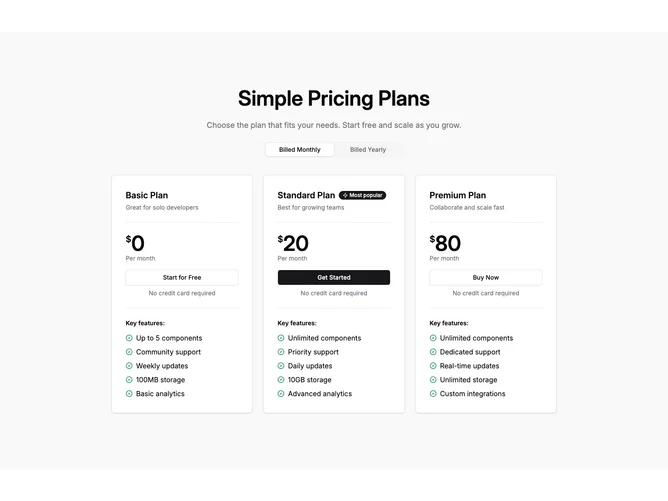
This block is built with Shadcn UI as a centered stack on a light muted section background. A large heading and optional description lead into tabs for billed monthly versus billed yearly. Under that, three matching cards show the plan name, optional small badge with a bolt icon when the tier is marked popular, a tagline or billing-specific blurb, a split dollar amount with large numerals, period text, and a full width primary or outline button. A fixed line about no credit card sits under the button, then a labeled feature list with circular check icons in a green tone.
Cards share the same white panel, border, and soft shadow so only typography and badges differentiate tiers. Feature lists use the same icon for every row for a consistent scan pattern.
The mood is calm SaaS marketing with emphasis on the tab control and the middle recommended tier when present. Interaction complexity stays moderate because only the billing tab and static plan content need to align.