

Pricing 3 block design & features
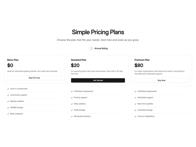
This is a three-column pricing section built with Shadcn UI. A centered heading and optional description sit above a switch for annual billing. Each column shows the plan name, price, short supporting copy, and a button with outline or primary styling depending on which tier is marked as recommended. Below each column, feature lines use check icons and thin horizontal rules between rows. On narrow viewports those feature blocks stay hidden and only appear once the layout is wide enough for three columns side by side.
Spacing is moderate, text uses muted gray for secondary lines, and card edges are simple rounded borders. The recommended tier reads through the solid primary button rather than heavy border treatments.
Overall the block stays minimal and close to default shadcn patterns. State is limited to whether billing is shown as yearly or monthly.
Narrow screens stack the three plans full width while the feature lists wait until the wide layout.