Pricing 91 block design & features
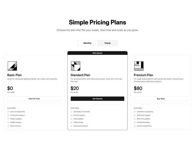
Built with shadcn/ui Button and ToggleGroup, this block reuses the pricing strip that pairs each tier with a small illustration, large price line, and bordered article shell, adapted to three columns instead of four. The heading stack follows that layout, then a full width toggle swaps prices, period lines, and blurbs for every card at once.
Each plan keeps the reversed flex header so the logo and title block read cleanly on wide and narrow widths. The highlighted column uses a primary top bar label and border treatment while others sit slightly lower on large screens for the same staggered rhythm.
Visually it is the logo-forward marketing grid familiar from the wider illustrated tiers, trimmed to a three-way comparison. Complexity stays moderate with static illustrations and a single billing state shared across cards.
On small screens the stack preserves card order and interior spacing before the grid snaps to three across on extra-wide breakpoints.