Shadcn Pricing Cards (2 Plans) Blocks

Browse and download 29+ Shadcn UI Pricing Cards (2 Plans) blocks. Built with React, Tailwind and shadcn/ui. These shadcn components are ready to download, copy and paste or install with the shadcn registry.

Shadcn Pricing 7 - Two-plan pricing with radio toggle and discount badge

Two-plan pricing with radio toggle and discount badge

Shadcn Pricing 84 - Container-wide pricing7-style two tiers

Container-wide pricing7-style two tiers

Shadcn Pricing 2 - Classic two-plan pricing with billing switch

Classic two-plan pricing with billing switch

Shadcn Pricing 83 - Wide two-plan pricing with billing toggle

Wide two-plan pricing with billing toggle

Shadcn Pricing 58 - Editorial Two-Plan Pricing Grid

Editorial Two-Plan Pricing Grid

Shadcn Pricing 59 - Compact Two-Plan Pricing Band

Compact Two-Plan Pricing Band

Shadcn Pricing 60 - Developer-Style Two-Plan Pricing

Developer-Style Two-Plan Pricing

Shadcn Pricing 61 - Left-Aligned Two-Plan Pricing With Tabs

Left-Aligned Two-Plan Pricing With Tabs

Shadcn Pricing 62 - Spotlight Two-Plan Pricing With Ring

Spotlight Two-Plan Pricing With Ring

Shadcn Pricing 63 - Asymmetric Two-Plan Pricing With Tabs

Asymmetric Two-Plan Pricing With Tabs

Shadcn Pricing 64 - Two-Plan Pricing With Top Border Accent

Two-Plan Pricing With Top Border Accent

Shadcn Pricing 68 - Two-Plan Pricing With Muted Feature Section

Two-Plan Pricing With Muted Feature Section

Shadcn Pricing 71 - Two-Plan Pricing With Feature Ribbon

Two-Plan Pricing With Feature Ribbon

Shadcn Pricing 72 - Offset Two-Plan Pricing Cards

Offset Two-Plan Pricing Cards

Shadcn Pricing 69 - Two-Plan Pricing With Segmented Radio Control

Two-Plan Pricing With Segmented Radio Control

Shadcn Pricing 73 - Elevated Two-Plan Pricing On Muted Surface

Elevated Two-Plan Pricing On Muted Surface

Shadcn Pricing 74 - Two-Plan Pricing With Popular Pill Badge

Two-Plan Pricing With Popular Pill Badge

Shadcn Pricing 75 - Two-Plan Pricing With Per-Card Billing Switch

Two-Plan Pricing With Per-Card Billing Switch

Shadcn Pricing 76 - Display Price Two-Plan Pricing With Feature Badges

Display Price Two-Plan Pricing With Feature Badges

Shadcn Pricing 79 - Spacious Rounded Two-Plan Pricing

Spacious Rounded Two-Plan Pricing

Shadcn Pricing 78 - Two-Plan Pricing With Dashed Feature Separators

Two-Plan Pricing With Dashed Feature Separators

Shadcn Pricing 80 - Bordered Two-Plan Section With Centered Header

Bordered Two-Plan Section With Centered Header

Shadcn Pricing 81 - Two-Plan Pricing With Primary Border Frame

Two-Plan Pricing With Primary Border Frame

Shadcn Pricing 82 - Compact Two-Plan Pricing Strip

Compact Two-Plan Pricing Strip

Shadcn Pricing 36 - Rounded-shell pricing cards with inline CTA strip

Rounded-shell pricing cards with inline CTA strip

Shadcn Pricing 35 - Bold static pricing cards with inverted highlight

Bold static pricing cards with inverted highlight

Shadcn Pricing 66 - Minimal Two-Plan Pricing Cards

Minimal Two-Plan Pricing Cards

Shadcn Pricing 67 - Two-Plan Pricing With Dark Card Contrast

Two-Plan Pricing With Dark Card Contrast

Shadcn Pricing 92 - Narrow two plan columns with tier logos

Narrow two plan columns with tier logos

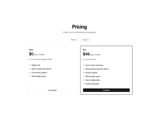
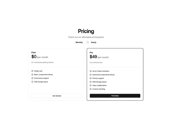
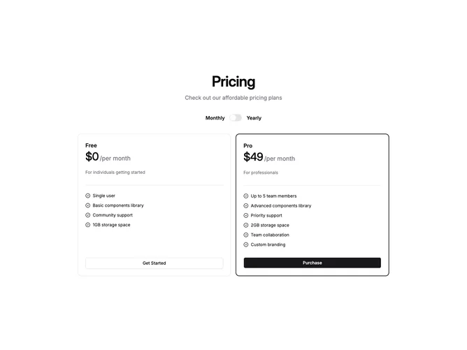
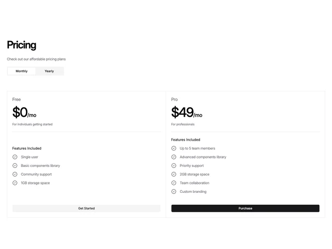
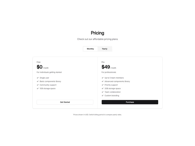
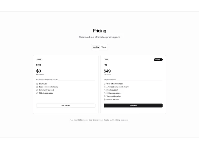
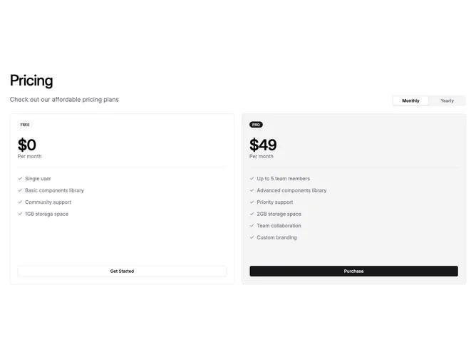
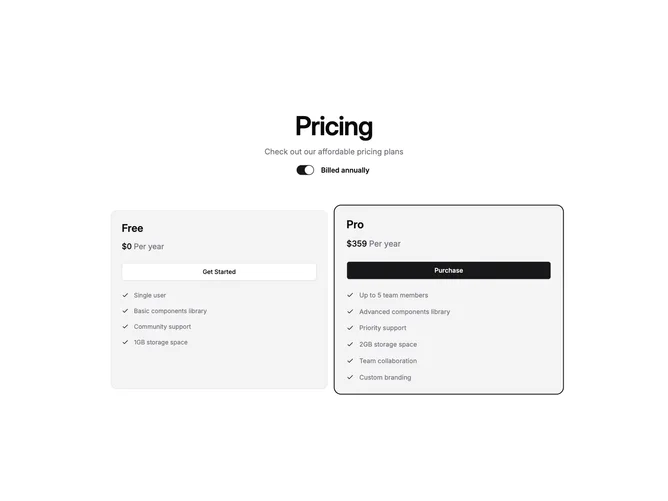
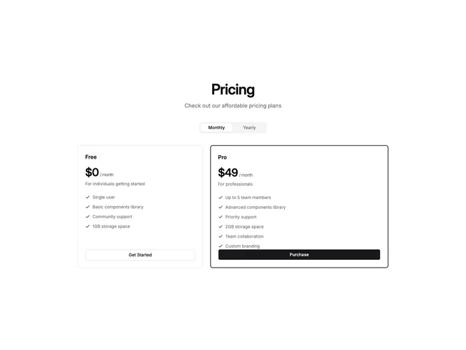
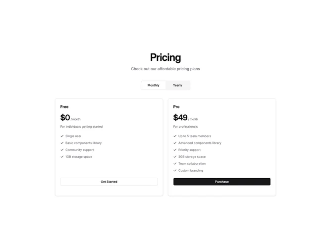
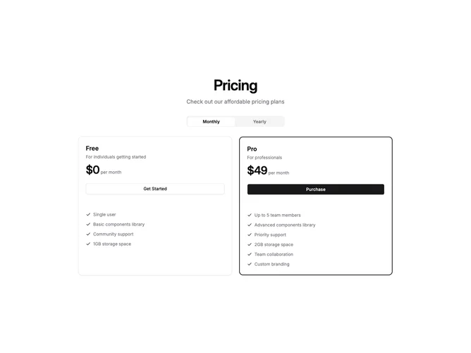
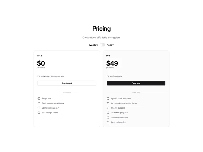
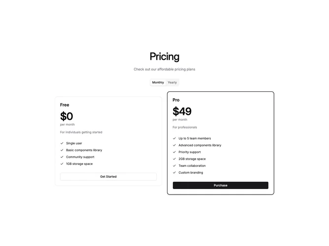
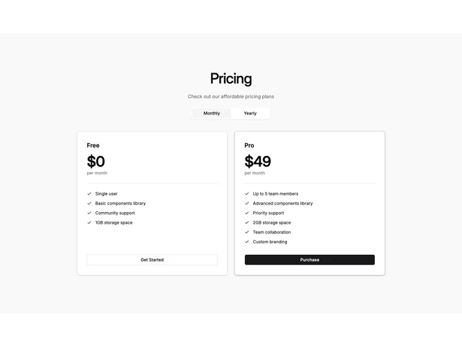
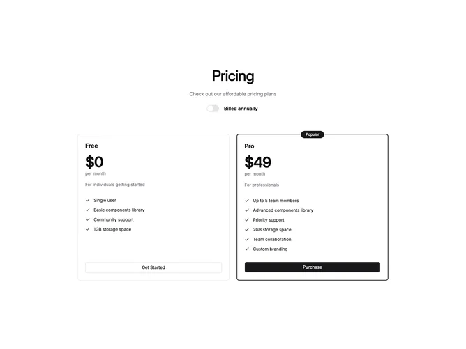
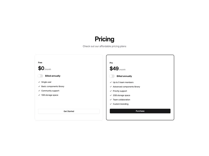
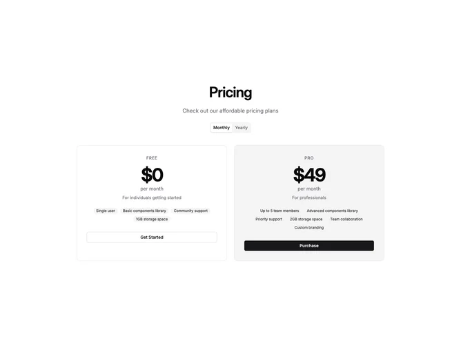
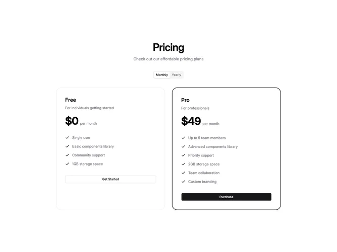
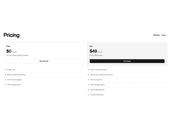
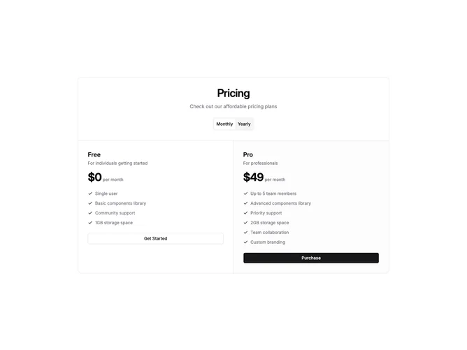
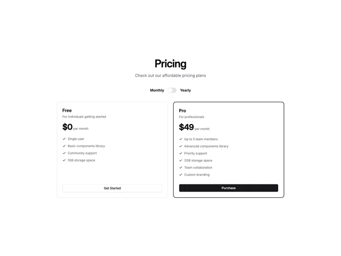
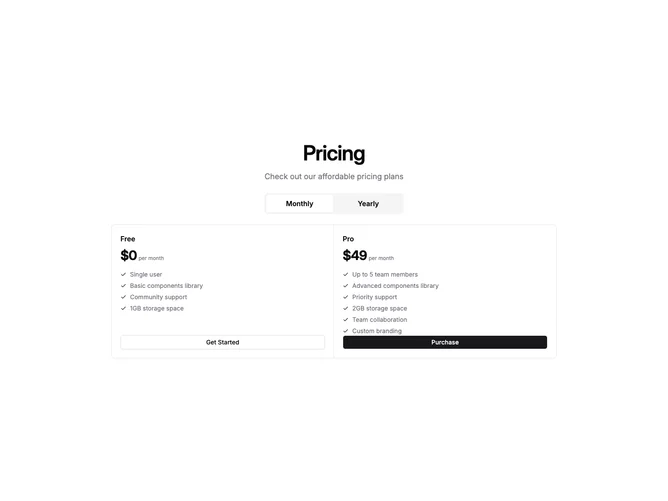
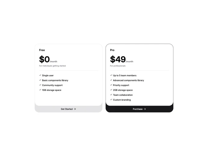
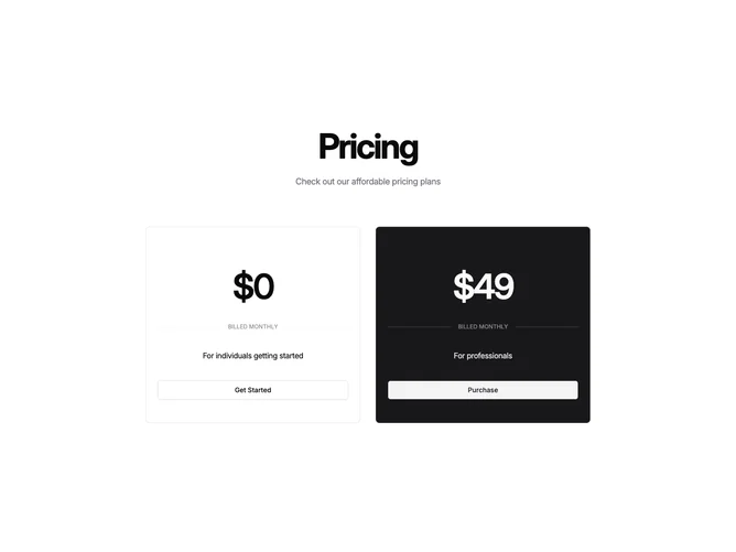
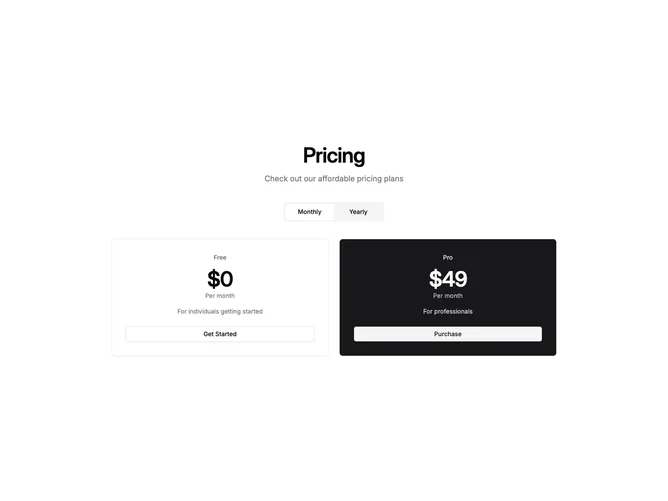
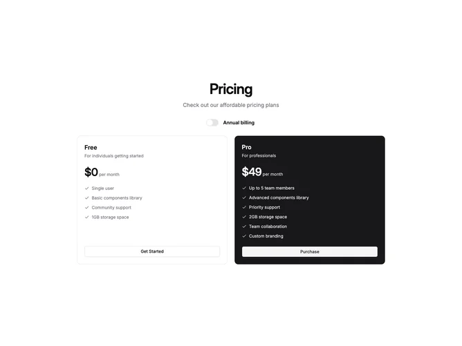
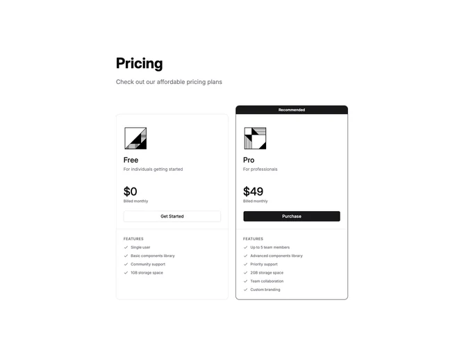
Shadcn Pricing Cards (2 Plans) Blocks, Sections & Components

A shadcn pricing cards (2 plans) block presents pricing content using card-based layouts. Cards provide clear visual separation between items and work well for showcasing distinct options or categories.

Each block is a self-contained React component which you can copy/paste the code or install via the shadcn CLI. You own the code — customize the layout, content, and styling using Tailwind utility classes.