Pricing 68 block design & features
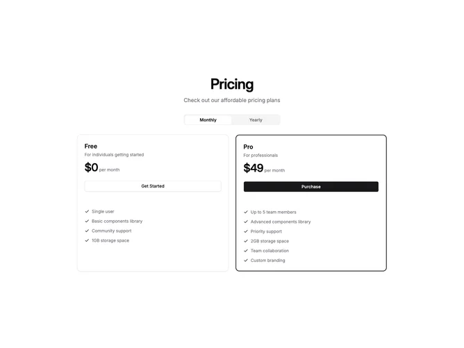
Built with shadcn/ui, this section displays a centered heading and tab-style toggle for billing period above a two-column card grid. Each card is visually split into two zones: the upper area holds the plan name, price, description, and a full-width button on the default card surface, while the lower area wraps the feature checklist in a rounded muted background band that creates a clear content boundary without extra borders.
The muted feature panel gives each card an embedded, layered feel that separates pricing details from the feature rundown. The second card gains a primary-colored double border to signal the recommended tier, and its button uses the default variant while the first card opts for outline. Primary-tinted check icons reinforce the theme throughout.
This split-zone approach works especially well when feature lists are lengthy because the shaded region keeps them visually contained. The tab toggle sits centered above the grid, keeping controls compact and leaving the cards free to focus on plan comparison in a clean, scannable layout.