Pricing 62 block design & features
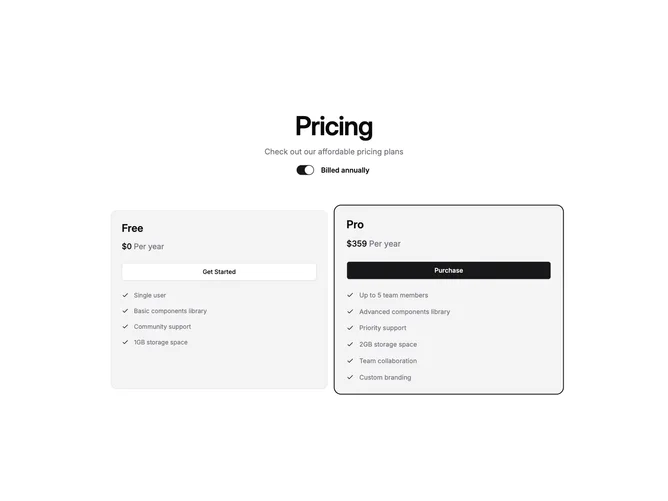
Built with shadcn/ui, this layout centers a title, optional description, and a single labeled switch for annual billing above a two-column grid of cards. Both cards sit on the semantic muted surface so they track light and dark themes automatically. The second plan scales up slightly inside a rounded wrapper and gains a primary-colored ring with ring offset, drawing the eye to the recommended tier without extra decoration.
Visual weight comes from borderless muted panels, generous card spacing, and typography rather than ad hoc gray scales. Each card shows the plan name, a combined price and period line, a full-width button, then a vertical feature list with small checks tinted to the theme primary color. The spotlight card uses the default button variant while the other uses outline, reinforcing the visual hierarchy.
The pattern feels bold and product-led, with the scale and ring emphasis creating a focused, decisive feel. Complexity stays low with one global billing flag driving both prices and only two plans to compare, making it well suited for products with a clear free-to-paid or basic-to-pro upgrade path.