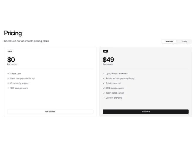
Pricing 61 block design & features
Built with Shadcn UI, this two-column pricing section places a left-aligned heading above a row that pairs descriptive text on the left with a pill-style monthly/yearly toggle on the right. Below, two equal-width plan cards sit side by side, each showing an uppercase badge, a large price, a period label, a separator, a check-marked feature list, and a full-width call-to-action button.
The second card receives muted background fill and a filled badge to distinguish it as the recommended tier, while the first card keeps an outline badge and outline button for contrast. On small screens the cards stack vertically, and from medium breakpoints upward they return to a two-column row.
The layout is clean and business-oriented, keeping visual weight on the price and feature comparison without extra decoration. It suits landing pages or product sites that offer a simple two-tier choice with transparent billing options.