Pricing 64 block design & features
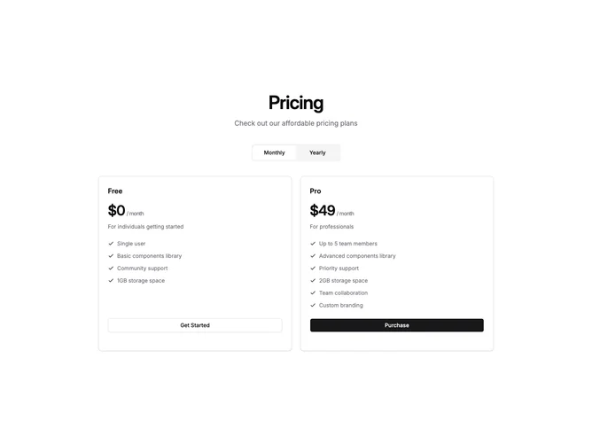
This layout uses shadcn/ui Card, ToggleGroup, and Button components to present two plans in a clean two-column grid below a centered title and muted-background billing toggle. Each card follows a consistent structure of plan name, large price, description, vertical feature list with primary-tinted check icons, and a full-width button in the card footer.
The recommended plan is set apart by a thick top border in the theme primary color, adding just enough visual distinction without overpowering the rest of the card. Both cards share subtle shadow and rounded corners, while the non-highlighted card uses an outline button to further soften its call to action relative to the default button on the accented card.
The result is a restrained, editorial pricing section where the colored stripe acts as a quiet recommendation signal. The toggle switches between monthly and yearly pricing with an optional discount badge, and the cards stack vertically on smaller screens to maintain the same reading order.