Pricing 60 block design & features
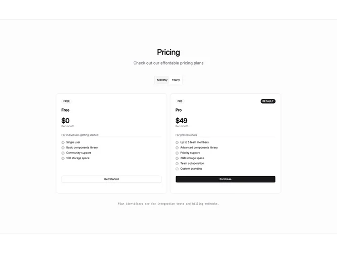
Two dashed-border plan cards sit side by side on a muted horizontal band, built with shadcn/ui Card, Badge, ToggleGroup, and Button components. The second column draws a solid primary border and carries a small default badge so it reads as the recommended tier without heavy decoration.
Headings and descriptions render in sans-serif while prices, plan-code badges, and the billing toggle stay in monospace, giving the section a developer-console feel. Feature lists use miniature check icons at a compact text size, and buttons remain small to keep the density high.
The overall tone is technical and text-first, closer to an API reference than a glossy marketing page. Plan identifier badges reinforce that the codes map directly to billing webhooks and integration tests.