Pricing 82 block design & features
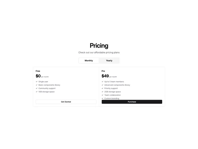
This shadcn/ui pricing block takes a compact, utilitarian approach by placing both plans inside a single bordered container with shared internal dividers and minimal padding. A small toggle-group for billing period sits above the strip, keeping the overall footprint tight and focused.
Inside the container, two cells sit side-by-side separated by a vertical divider on desktop and a horizontal divider on mobile. Each cell packs the plan name, price, a tightly-spaced feature list with small check icons, and a small-size full-width button into a compact vertical flow. There is no visual differentiation between the two plans — both receive equal treatment.
The dense layout works well in dashboards, app settings panels, or anywhere screen real estate is limited. Despite the reduced sizing, the component remains scannable thanks to clear typographic hierarchy and consistent spacing between each element.