

Pricing 35 block design & features
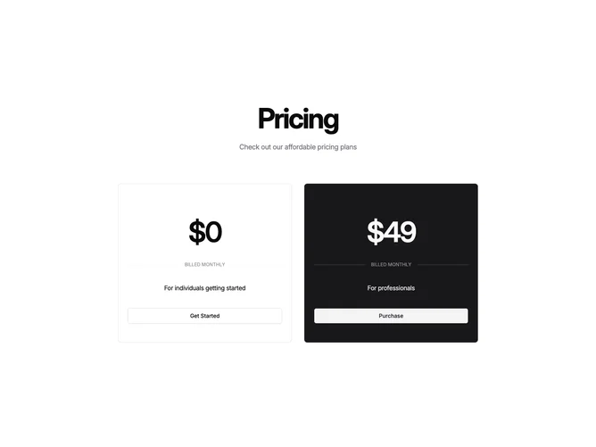
Built with shadcn/ui Card and Button components, this block places a large centered heading and description above two side-by-side plan cards on desktop that stack vertically on smaller screens. There is no billing toggle; each card displays a single oversized monthly price centered in the card, flanked by thin horizontal rules with a small uppercase "Billed monthly" label between them. An optional savings line appears below when a discount value is provided. A short plan description and a full-width CTA button round out each card.
The highlighted plan fills its entire card with the primary color, inverting all text and internal dividers to the primary-foreground token. The secondary button on the highlighted card uses the secondary variant so it contrasts against the dark fill. The non-highlighted card stays on the default background with an outline button. This full-surface color inversion creates strong visual weight without relying on borders, shadows, or rings.
The aesthetic is bold and typographically driven. Prices dominate each card through sheer scale and tight tracking, and the minimal supporting elements (divider, billing label, description) are set small and muted to stay out of the way. No feature lists or checkmarks appear, making this a deliberately simplified pricing block that focuses on price and CTA over detailed comparisons.
On mobile the cards stack vertically and maintain the same internal proportions. The block is static with no interactive controls, keeping it simple to implement and fast to render.