Pricing 63 block design & features
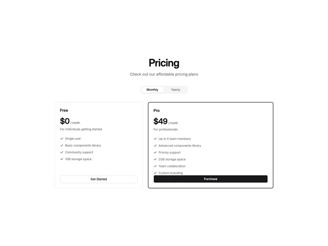
Built with Shadcn UI, this pricing section centers a heading and description above a tabs-based billing toggle, then splits two plans across an asymmetric twelve-column grid. The first plan occupies five columns while the recommended plan takes seven, giving the wider card noticeably more visual weight at desktop widths without resorting to scale transforms or overlapping elements.
Both cards share the same vertical rhythm of plan name, price with period suffix, short description, a vertical check-icon feature list, and a full-width button. The wider card gains a double-width primary border to reinforce the recommendation, while the narrower card stays with a standard single border and outline button, keeping the hierarchy clear through proportion and color alone.
The overall effect is confident and asymmetric, nudging users toward the larger card through spatial dominance rather than badges or labels. The layout collapses to a single column on mobile, preserving readability and restoring equal weight to both options when horizontal space is limited.