Pricing 81 block design & features
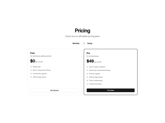
Built with shadcn/ui, this pricing section uses a creative border-frame technique to highlight the recommended plan. A thin primary-colored outer shell wraps the second card, with the inner content area set to the page background color. The result is a crisp, solid-color border that stands out more than a standard CSS border without relying on box shadows or gradients.
A labeled switch above the cards lets visitors toggle between monthly and yearly billing. The first card uses a plain border for contrast, letting the primary-framed card draw the eye naturally. Both cards share an identical internal layout — plan name, price, description, feature checklist, and a full-width CTA button — so users can compare plans at a glance.
The two-column grid collapses to a single column on smaller viewports while preserving the distinctive border-frame highlight. This pattern works well when you want a strong visual recommendation cue without adding background fills, badges, or other decorative elements.