Pricing 67 block design & features
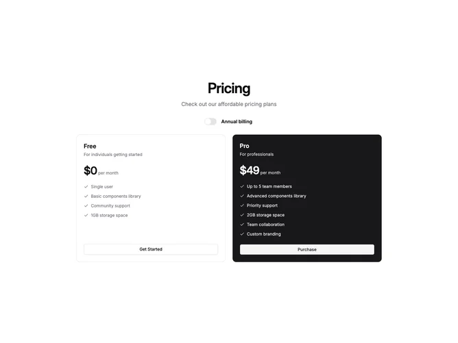
Built with shadcn/ui, this layout places a centered heading, description, and labeled billing switch above a two-column grid of pricing cards. The first card uses the default bordered surface while the second swaps foreground and background colors to create a bold dark panel that adapts automatically to any theme without hard-coded color values.
The inverted card achieves its visual weight entirely through semantic tokens. Feature text and check icons use a reduced opacity variant of the background color for a natural muted effect, and the call-to-action button switches to the secondary variant so it inverts cleanly alongside its container. The result is strong visual hierarchy between the two tiers with zero custom color declarations.
The pattern works well for products with a clear free-versus-paid split. The dark card draws the eye to the recommended plan while keeping the overall composition balanced and readable across both light and dark modes, making it a low-maintenance choice for teams that ship multiple themes.