Pricing 78 block design & features
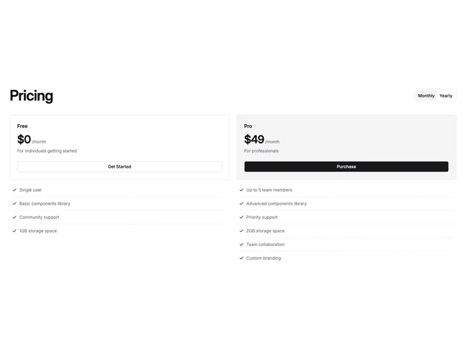
This shadcn/ui pricing section pairs a left-aligned heading with a ToggleGroup billing switch on the same row, keeping the top of the section compact and scannable. Below, two cards in a responsive grid display the plan name, a bold price, a short description, and a full-width action button.
Feature lists appear beneath each card, separated by dashed horizontal Separator rules that give the section a distinctive ledger-like rhythm. Each feature row uses a Check icon for quick visual scanning, and the dashed lines create clear breathing room between items without heavy visual borders.
The second plan card fills with the muted background to signal the recommended tier, while button variants shift from outline to default. On mobile the grid collapses to a single column, and the dashed feature lists remain legible and well-spaced at every viewport width.