Pricing 66 block design & features
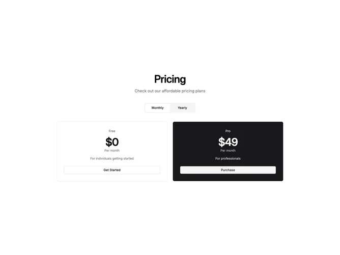
This Shadcn UI pricing section strips the two-plan format down to its essentials by showing only the plan name, a large centered price, a brief description, and a full-width button. There is no feature list at all, placing the focus entirely on price comparison and a quick conversion decision. A muted-background toggle group for monthly and yearly billing sits between the heading and the two narrow, centered cards.
The recommended plan uses an inverted primary-fill card with primary-foreground text, making it impossible to miss against the standard bordered card beside it. The inverted card carries a secondary button variant to maintain contrast, while the default card uses an outline button, preserving a clear visual hierarchy with minimal decoration.
The result is a bold, reductive pricing block suited to products where the value proposition is already understood and the only decision left is which tier to pick. The narrow max width and generous padding keep the section feeling spacious and confident, and the cards stack cleanly on mobile without losing their distinct visual identities.