
Cta 23 block design & features
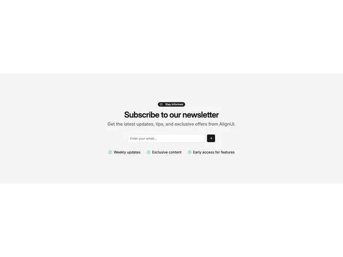
Cta23 is a centered newsletter conversion stack built with shadcn/ui on top of a muted section background. A badge with mail icon leads into a semibold heading and a slightly brighter muted paragraph sized up on larger breakpoints. The email capture sits inside a rounded group where the text field shares a row with an icon-only submit button. Beneath that, optional benefit strings render as a wrapping row of compact lines each prefixed by a green check glyph.
Spacing bias pulls everything toward the vertical middle on desktop while mobile aligns elements flush left until typography recenters at medium widths. The visual rhythm reads airy despite the stacked controls because gaps widen on xl breakpoints.
This skews friendly consumer SaaS rather than stark enterprise forms thanks to the badge flourish and colorful checks. Complexity stays moderate: copy plus a handful of perk phrases matter as much as the layout itself.
Below medium widths the column aligns flush left while typography scales down slightly so the inline submit row still fits without wrapping awkwardly.