Feature 181 block design & features
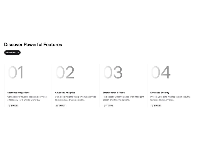
Feature181 organizes four selling points inside a disciplined editorial grid wired with Shadcn UI Badge and Button elements. Above the columns, copy sits left aligned with a bold section title and a rounded primary call to action carrying a trailing arrow icon. Each column begins with a towering light-on-light index figure that reads more as atmosphere than literal numbering, then transitions into a concise feature name, supporting paragraph in muted tone, and a compact outline badge that pairs a clock glyph with a short timing claim.
Hairline left borders separate columns on medium and up, while vertical spacing scales slightly so the numerals breathe. Secondary iconography per feature lives inside the badge row rather than as large pictograms, keeping attention on typographic storytelling.
The block feels modern and slightly editorial: big numerals give rhythm, timing badges imply quick wins, and the single CTA suggests a funnel step more than passive reading. Complexity is moderate; you need four coherent feature narratives plus honest time labels. Uniqueness hinges on the oversized index treatment, which is less common than simple circled digits.
On small screens columns stack; borders and spacing adjust so each story remains a self-contained vertical strip before the multi-column layout returns.