Feature 163 block design & features
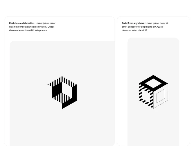
Feature163 is built with Shadcn UI spacing and container conventions around a single grid that becomes five columns and two rows on large screens. Each of the four cards is a flex column with padding, a semibold lead fragment, lorem body text, and an image whose rounding varies by cell (top-only, diagonal pairs, or fully rounded) while staying inside a thin gray border.
The look stays airy and product-marketing oriented: white cards, muted borders, and images cropped from the bottom so photography feels anchored. Active corners differ per tile, which breaks the symmetry of a standard four-up grid without adding extra chrome.
Overall this is an asymmetric, editorial-style feature wall. It is more layout-intensive than a simple icon list because every tile negotiates its own image inset and radius, yet it stays image-and-copy driven rather than interaction heavy.
On small viewports the grid collapses to a single column of four stacked cards before the wide asymmetric spans activate.