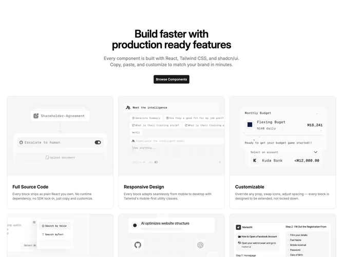
Feature 148 block design & features
Feature148 packages a centered marketing header with primary action plus a dense utility matrix using Shadcn UI button and card primitives fed from shared placeholder props. Upper band centers balanced headline and paragraph with generous line height, followed by full-width call-to-action linking outward, then six capped cards each leading with landscape photograph, title line, and muted description block inside frameless cards that only round the image tops.
Contrast comes from photography saturation against typographic calm, borderless cards letting imagery define silhouettes, consistent internal padding keeping columns even, text scales jump between display heading and semibold card titles. Hover states inherit button defaults; grid gutters breathe on large breakpoints.
This lands as pragmatic product marketing: structured, repeatable, approachable. Complexity sits in content upkeep because half a dozen distinct stories need images and succinct blurbs although scaffolding stays simple grids. Decorative complexity is imagery-led rather than illustration heavy.
Breakpoints collapse columns progressively so readability holds from single-column mobile through widened trio layout without cramped gutters.