
Compare 6 block design & features
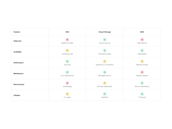
Compare6 is a technical comparison matrix built with Shadcn UI. A bordered table fixes column widths so “Feature,” “SSD,” “Cloud Storage,” and “NAS” stay aligned while six attributes list down the left. Each intersecting cell centers a circular status glyph (green check, red X-like mark, amber minus) plus a textual rating such as lifespan or scalability notes. The table header sticks while scrolling within the section-sized viewport behavior implied by sticky classes.
Muted body text accompanies icons, headings use medium weight primaries on the sticky row, and every cell wears a crisp border grid for readability. Tabs appear only below medium width to swap which model column is visible, while medium and up reveal all columns together.
Overall it reads factual and datasheet-like rather than flashy. Complexity is moderate: you maintain parallel attribute lists per model so icon meaning stays honest. Decorative work is minimal; signaling comes from color rings and succinct strings.
Portable screens lean on tabs to reduce horizontal crowding without losing the bordered table motif on larger canvases.