Feature 187 block design & features
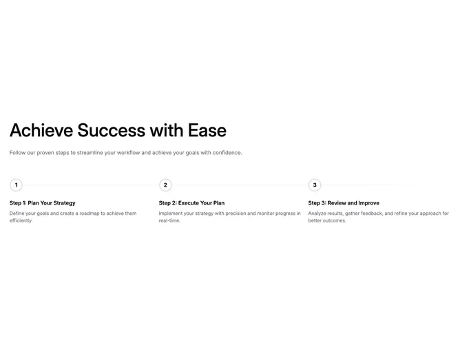
This block is a simple, structural timeline that complements pages built with shadcn/ui, using layout and typography without additional primitives. The top holds a strong section title and a supporting paragraph in muted foreground color. Below, three steps render in a responsive grid: each step shows a bold numeric badge inside a white circle with a thick ring, a step title, and paragraph-style explanation text.
The connector reads as a muted band: on large screens it runs horizontally between steps under the number row; on smaller screens the layout shifts so the line reads vertically beside the stacked content. The last step gets a tapered gradient on the connector so the sequence feels finished rather than cut off.
Visually this is close to a minimal marketing wireframe: black primary headings, muted body copy, hairline borders on the step discs, and no icons or imagery. It is a compact pattern for explaining a short linear workflow.
Because there are only three fixed slots, adapting real content means editing titles and descriptions rather than wiring a long list. The block stays lightweight and fast to customize.