Timeline 6 block design & features
This component provides a reusable UI element for your application.
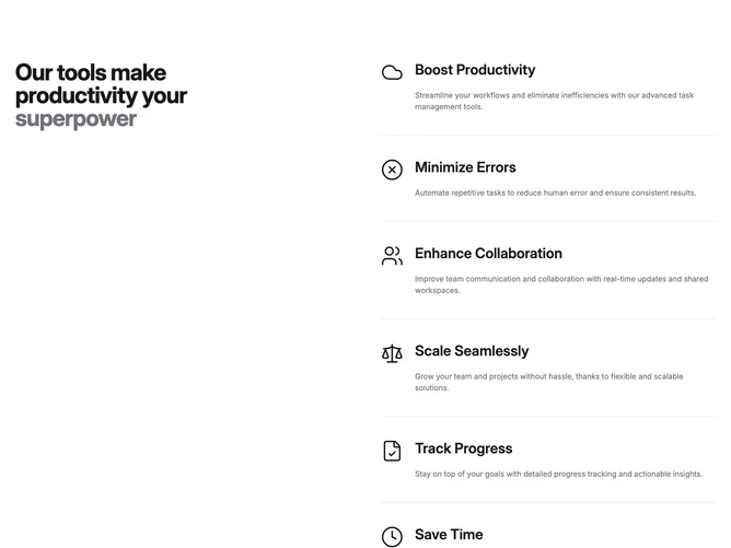
A two-column component featuring a sticky section with a bold statement on the left and a scrollable section on the right showcasing icons with related titles and descriptions.
This component provides a reusable UI element for your application.