

Feature 142 block design & features
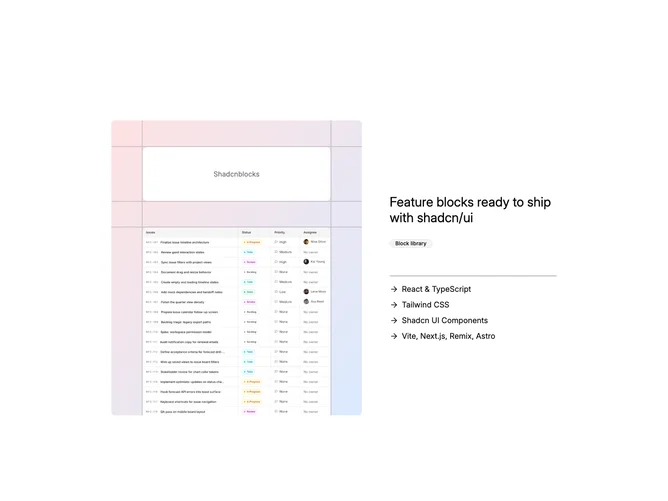
Feature142 showcases product talking points inside Shadcn UI primitives: a bordered mesh panel shares a row with prose and a capped checklist. Left column stacking uses an asymmetrical ratio so a small label capsule sits centered within the upper interior band while the dominant lower band carries a cropped image stretching full bleed of its cell walls. Arrow icons prefix each truncated feature title inside the sibling column to scan like inline bullets without separate list chrome.
Muted gradient wash from warm to cool pastel tints hugs the lattice, border strokes echo sketch lines, inset label panel keeps flat background contrasting the mesh rails, and typography stays large on the lateral heading descending to subdued list tint. Shadows stay minimal letting line art carry depth; motion stays limited to native hover on links elsewhere.
Tone lands modern marketing with a crafty diagram flair that looks slightly more staged than bare cards yet still restrained. Complexity is modest: headline, eyebrow badge object, cropped photo, capped feature array props, optional className overrides. Lattice plus gradient are coded structure not artwork, keeping iteration fast.
Responsive treatment stacks mesh above copy on narrow widths while preserving proportional rail thickness so the scaffold still communicates before the textual list appears.