
Testimonial 1 block design & features
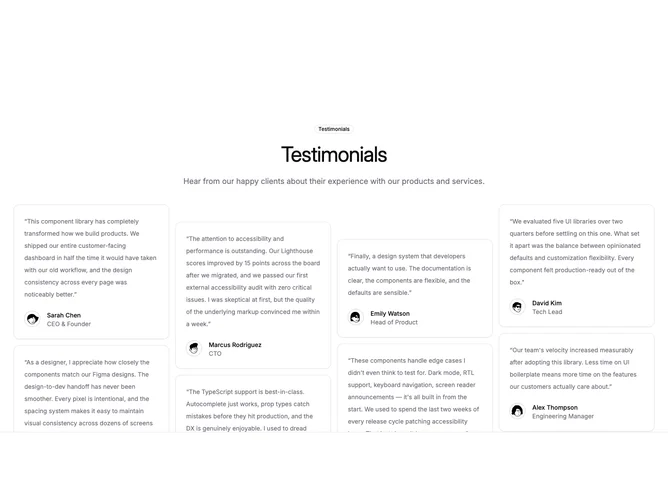
Testimonial1 is a centered testimonial section built with shadcn/ui, opening with an optional outline badge, a large heading, and a supporting description. Below the header, up to eight testimonial cards fill a fixed-height viewport in a multi-column layout. Each card holds a quoted paragraph, a circular avatar with a thin ring, and the reviewer name and role stacked beneath the quote.
The cards sit in vertically offset columns so adjacent stacks do not align on the same baseline, creating a staggered masonry rhythm. Cards use the default surface styling with muted quote text and compact footer rows. Avatars are small and circular with a subtle border ring. The section has generous top padding and a bottom border separating it from what follows. No motion or hover effects are applied.
This reads as a straightforward social proof grid with a slightly editorial stagger rather than a flat uniform wall. The pattern is common for testimonial walls but the column offset and capped viewport height give it a tighter, gallery-like presentation. Moderate complexity: you need a heading, optional badge text, and multiple short quotes each paired with an avatar image, name, and role.
The column count grows from two on small screens to three on medium and four on large, with deeper vertical offsets on wider layouts. Cards outside the fixed height area are clipped, so the section reads as a peek into a longer feed rather than showing every quote at once.