

Shadcn Testimonial Basic Grid Blocks

Browse and download 10+ Shadcn UI Testimonial Basic Grid blocks. Built with React, Tailwind and shadcn/ui. These shadcn components are ready to download, copy and paste or install with the shadcn registry.

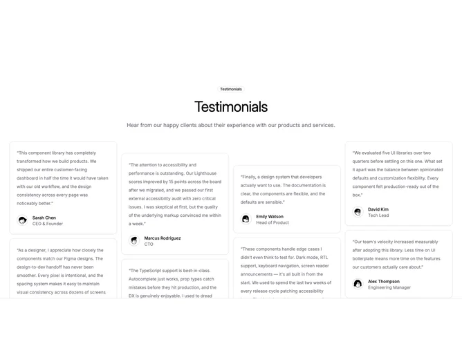
Shadcn Testimonial 1 - Staggered column testimonial grid

Staggered column testimonial grid

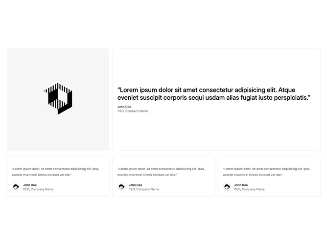
Shadcn Testimonial 4 - Featured quote with supporting cards

Featured quote with supporting cards

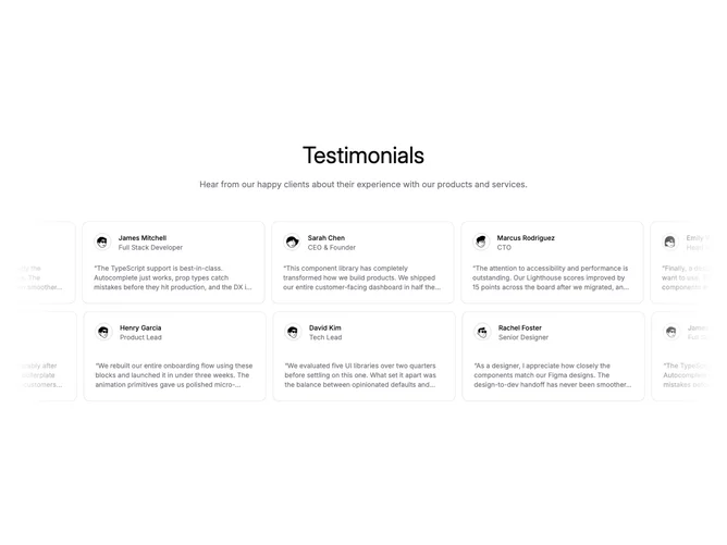
Shadcn Testimonial 7 - Dual auto-scrolling testimonial rows

Dual auto-scrolling testimonial rows

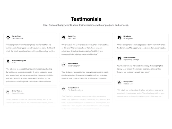
Shadcn Testimonial 8 - Masonry testimonial wall with fade

Masonry testimonial wall with fade

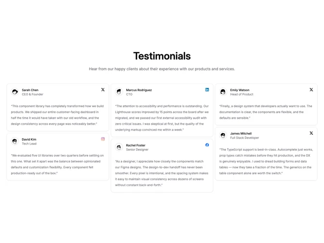
Shadcn Testimonial 9 - Masonry quotes with source icons

Masonry quotes with source icons

Shadcn Testimonial 19 - Auto-scrolling testimonial card row

Auto-scrolling testimonial card row

Shadcn Testimonial 21 - Expert quotes with company logos

Expert quotes with company logos

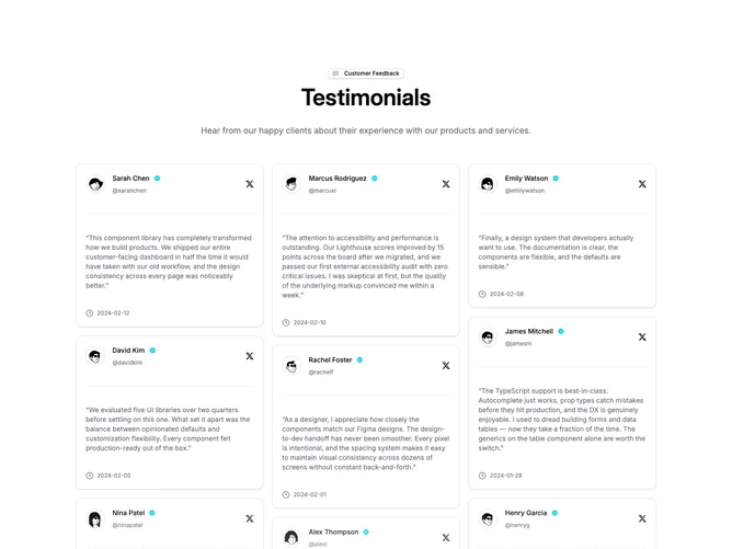
Shadcn Testimonial 23 - Masonry testimonial cards with badge

Masonry testimonial cards with badge

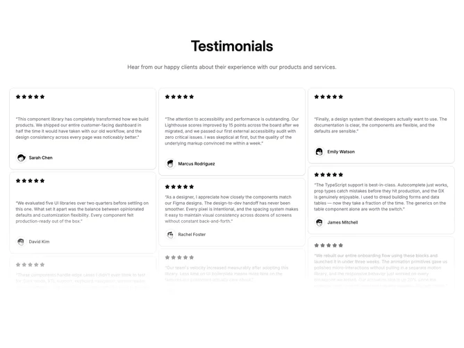
Shadcn Testimonial 24 - Masonry star-rated quotes with fade

Masonry star-rated quotes with fade

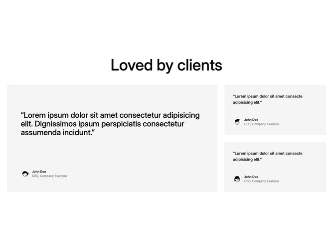
Shadcn Testimonial 33 - Bento featured testimonial grid

Bento featured testimonial grid

Shadcn Testimonial Basic Grid Blocks, Sections & Components

A shadcn testimonial basic grid block arranges testimonial content in a structured grid layout. Grid designs maintain consistent sizing and alignment, making them ideal for displaying multiple items with visual balance.

Each block is a self-contained React component which you can copy/paste the code or install via the shadcn CLI. You own the code — customize the layout, content, and styling using Tailwind utility classes.