
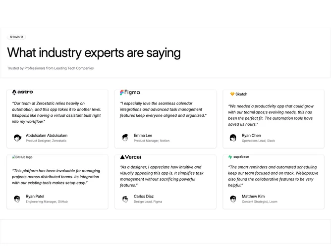
Testimonial 21 block design & features
Testimonial21 is a testimonial grid built with Shadcn UI. A full-width header band with top and bottom borders holds an outline badge with a handshake icon, a large heading, and a muted supporting line. Below, six cards sit in a three-column grid. Each card shows a company wordmark, an italic quoted paragraph, and a circular author photo beside the name and role. A matching bordered spacer band closes the section.
Cards use the default background, small radius, and light shadow. Wordmarks sit at the top of each card. Quote type is muted and italic. Author photos are medium circles. The header type is large with tight letter spacing, so the heading dominates the top of the section. Horizontal rules and side borders give the header and footer a framed, site-chrome feel. Nothing animates.
It reads as a corporate expert-endorsement wall: logos first, then the quote, then a named person from a known company. The bordered header and empty footer band make it feel more like a page module than a loose card cluster. Moderate complexity and content-driven: six quotes plus matching wordmarks, photos, names, and roles.
The grid is one column on small screens, two in the middle, and three on large. The header heading scales up on wider viewports, and the footer spacer grows taller.