
Testimonial 23 block design & features
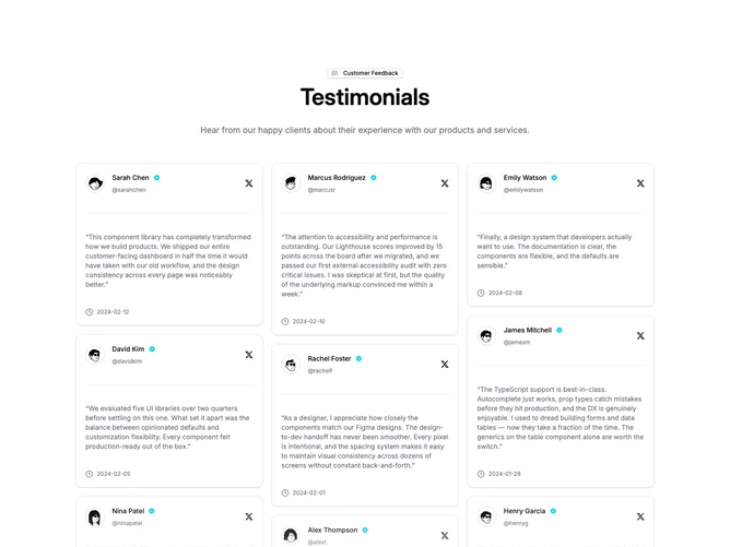
Testimonial23 is a masonry testimonial grid built with shadcn/ui, topped by an optional outline badge, a centered heading, and a description line. Below the header, testimonial cards flow into a CSS columns layout. Each card is a shadcn Card with rounded corners and light shadow, showing an avatar with a verified badge icon, a username, a dashed separator, the quoted testimonial text, and a timestamp with a clock icon. A primary "See More" button with a chevron sits centered beneath the grid.
Cards break inside columns naturally, producing uneven column heights typical of a masonry pattern. The grid fades at the bottom through a pseudo-element gradient overlay that transitions to the background color, partially obscuring the lowest cards. The column count adapts dynamically via a resize listener, and testimonials are reordered at render time to distribute evenly across columns.
The tone is social-media inspired, with verified checks, @-handles, and small X-logo icons giving each card a tweet-like appearance. The badge label at the top and the "See More" button at the bottom frame the grid as a curated collection.
On mobile the cards stack into a single column. Medium screens show two columns, and large screens display three.