





Shadcn Testimonial Carousel Blocks

Browse and download 11+ Shadcn UI Testimonial Carousel blocks. Built with React, Tailwind and shadcn/ui. These shadcn components are ready to download, copy and paste or install with the shadcn registry.

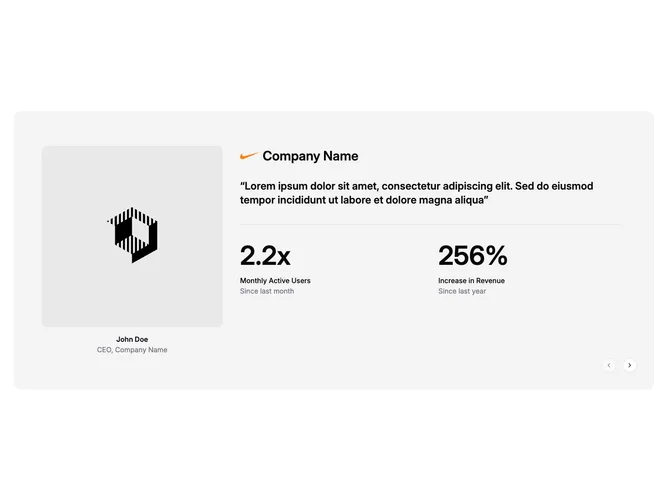
Shadcn Testimonial 12 - Testimonial carousel with stats

Testimonial carousel with stats

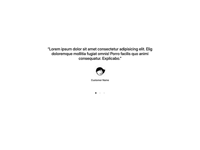
Shadcn Testimonial 14 - Testimonial carousel with dot navigation

Testimonial carousel with dot navigation

Shadcn Testimonial 26 - Quote carousel with dot indicators

Quote carousel with dot indicators

Shadcn Testimonial 28 - Dashed-border testimonial carousel

Dashed-border testimonial carousel

Shadcn Testimonial 31 - Testimonial Carousel with Photo Cards

Testimonial Carousel with Photo Cards

Shadcn Testimonial 41 - Centered Testimonial Carousel with Faded Edges

Centered Testimonial Carousel with Faded Edges

Shadcn Testimonial 42 - Left Aligned Carousel With Four Columns

Left Aligned Carousel With Four Columns

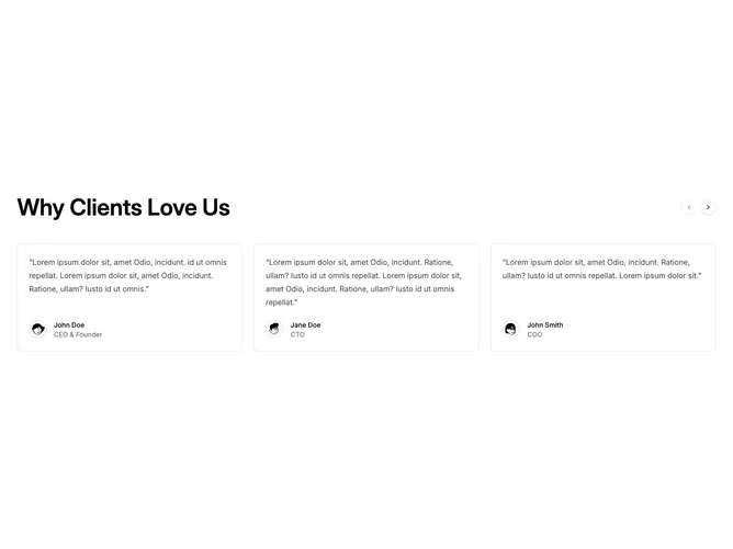
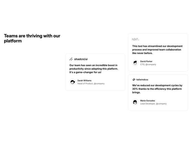
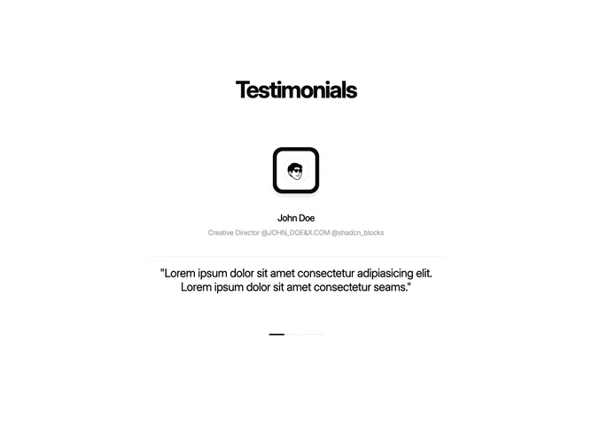
A shadcn testimonial carousel block presents testimonial content in a swipeable carousel or slider format. This layout is effective for showcasing multiple items in limited space while keeping the page compact.

Each block is a self-contained React component which you can copy/paste the code or install via the shadcn CLI. You own the code — customize the layout, content, and styling using Tailwind utility classes.