

Testimonial 6 block design & features
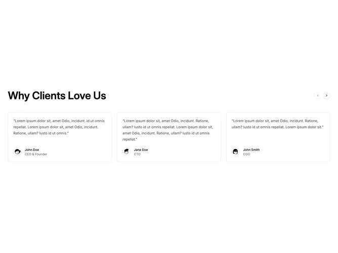
Testimonial6 is a heading-plus-carousel section built with shadcn/ui. A large title sits on the left with previous and next arrows on the right. Below, a horizontal track of bordered cards shows a quoted paragraph, then a footer row with a circular avatar, name, and role. Six quotes ship in the sample set.
On the page, the heading is heavy and scales up sharply on wide screens while the arrows stay small and sit in the header rather than over the cards. Each card has a light hairline border, rounded corners, muted quote text, and a thin ring on the avatar. Cards share a common height so the row stays even. Motion is the carousel itself: click or swipe to move along the track.
This is a familiar product-style carousel rather than a static grid. The header-aligned arrows and equal-height bordered cards keep it close to a default shadcn look. Moderate complexity and content-driven: you need a heading plus several short quotes, each with an avatar image, name, and role.
One card shows at a time on small screens, two on medium, and three on large.