Testimonial 31 block design & features
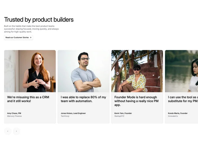
Testimonial31 is a testimonial section with a left-aligned header area and a horizontal carousel of testimonial cards that extends beyond the container edge. Each card features a large portrait photo at the top, a quote in the middle, and author information at the bottom. The section can optionally display a dashed line separator below.
The visual treatment uses muted background cards with no border for a soft look. Photos are displayed in a tall aspect ratio with object-cover and object-top positioning to focus on faces. Quotes use medium font weight with tight leading for impact. The carousel navigation buttons are large (size-14) with muted backgrounds.
This testimonial section follows the mainline design system with its clean card styling and optional dashed line accent. The carousel extends past the container edge on the right for a dynamic, magazine-style layout. The combination of large photos and prominent quotes creates an engaging social proof section.
The carousel uses Embla with loop enabled and start alignment. Cards have responsive basis values that show more cards on larger screens. Navigation buttons are positioned below the carousel in a horizontal row. The dashed line at the bottom provides visual separation from the next section.