

Testimonial 14 block design & features
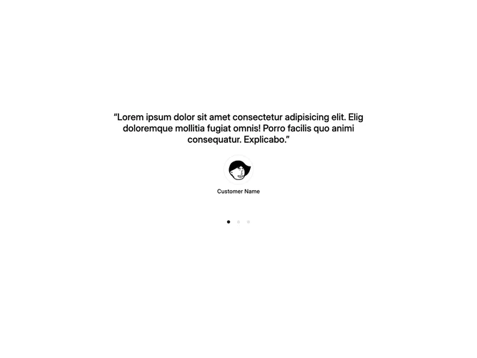
Testimonial14 is a carousel testimonial section built with Shadcn UI, centering each slide's content on the page. Every slide displays a quoted testimonial in medium-weight type, a circular avatar below it, and the customer's name. A row of dot indicators beneath the carousel lets users jump directly to any slide.
Quote text scales up on larger screens and sits inside curly double-quote marks. Avatars render with the shadcn Avatar component, sized responsively from small to large. The dot navigation uses ghost-variant buttons, each containing a small circle that fills with the primary color when its slide is active and stays on the input color otherwise. Slide tracking is managed through a carousel API effect that syncs the selected index to local state.
The feel is clean and focused, presenting one voice at a time without cards, borders, or background treatments. Complexity is moderate because the component wires up the carousel API for controlled dot navigation alongside the default swipe behavior.