

Testimonial 17 block design & features
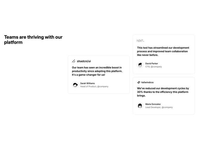
Testimonial17 is a heading-plus-quotes section built with shadcn/ui. A bold title sits on the left. Beside it, three cards each open with a company wordmark, then a large quote, then a circular avatar with name and role. On small screens those cards become a swipe carousel with a row of dots beneath.
Each card opens with a company wordmark, then a bold quote in a large rounded shell with a hairline border. Avatars are a step larger than a typical card footer and sit in a ringed circle beside the byline. On large screens the three cards sit in an uneven pair: one tall card beside two stacked cards. On small screens the same cards slide one at a time, with circular dots that fill when active.
The desktop arrangement is a compact bento of quotes rather than a flat three-up row, and the mobile carousel is the practical counterpart. Logos on each card make the proof feel company-attributed, not only personal. Moderate complexity and mixed: a heading plus three quotes, each needing a wordmark, avatar photo, name, and role, with the carousel reserved for the narrow layout.