

Testimonial 29 block design & features
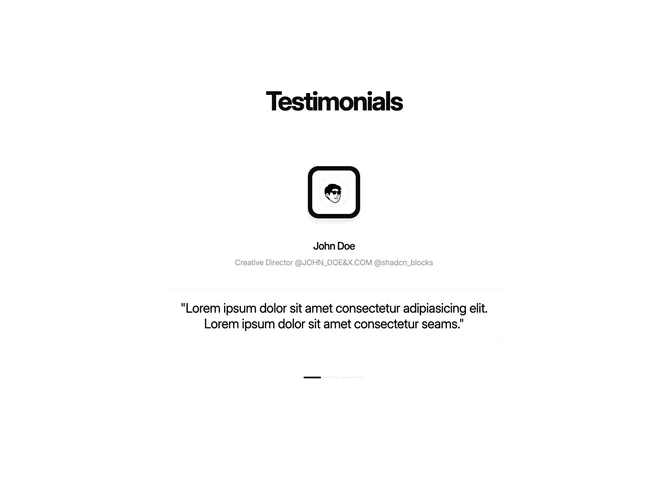
Testimonial29 is a single-slide testimonial carousel built with Shadcn UI. A very large centered heading sits above an autoplay track. Each slide stacks a large framed avatar, the speaker name, a muted role line that reads like social handles, and an oversized centered quote. A row of pill indicators under the quote marks the active slide.
The avatar sits in a dark rounded square frame with an inner light well and a heavy drop shadow, so the photo feels inset. Name type is large with tight letter spacing; the role is lighter and smaller. The quote is large, centered, and borderless. Inactive pills are short and muted; the active pill is longer and solid. The section background is plain. Slides advance on a short timer and loop.
This is a bold, speaker-first slider rather than a card grid. The oversized framed portrait is what makes it distinctive; the rest of the layout is simple. Complexity is low to moderate and content-driven: several quotes, each with a photo, name, and role. The sample quotes read as placeholder copy.
The stack stays centered at every width. Quote size steps up on medium screens. Indicators are display-only.