
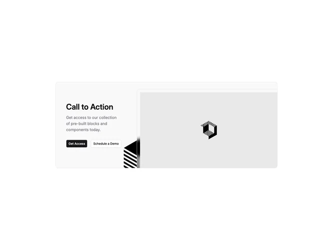
Cta 18 block design & features
Cta18 is a split call-to-action built with shadcn/ui inside a rounded, bordered card on a muted base. The text column carries a semibold headline, muted body copy, and two linked buttons where the secondary slot can include an inline icon next to its label. The media column layers a sharply rotated decorative SVG behind a primary rectangular image that picks up a thick inner offset along the top and leading edges so the photo reads as inset.
The visual story leans on contrast between flat typography and playful image angles: one asset floats off-axis while the hero crop stays crisp with border cues and backdrop blur hints along the framed corner. Spacing keeps the copy column centered vertically relative to the image stack on medium screens and above.
This block is moderately elaborate for a CTA because the photography treatment and skewed accent shape do most of the personality work. It suits teams that want marketing copy plus a strong visual anchor without a full hero height.
On narrow viewports the layout stacks so text leads and imagery follows inside the same rounded shell, with overflow clipped to keep the diagonals tidy.