Resources 1 block design & features
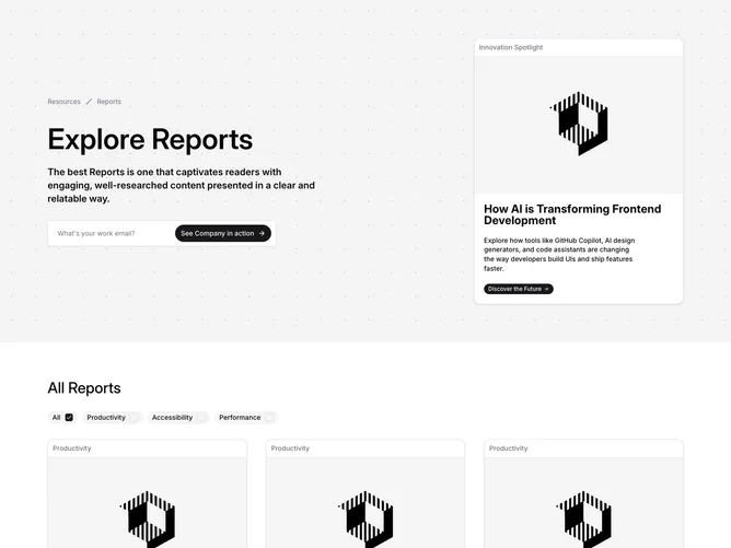
The Resources1 component is a well-structured presentation block focusing on various reports and resources, elegantly integrating filtering and navigation functionalities. This shadcn block serves as a prime example of how content-heavy sections can be organized and made interactive to enhance user engagement. It features a significant locale for showcasing well-curated reports and allows for actionable user interaction through subscription and filtering options.
At its core, this shadcn component provides an engaging user experience by combining a breadcrumb navigation system, detailed report cards, and a sophisticated filtering form. The component facilitates browsing through various categories of reports, thereby promoting targeted content exploration. Moreover, it includes a prominent call-to-action feature, which prompts users to subscribe or explore specific reports, fostering increased interaction and prolonged on-page presence.